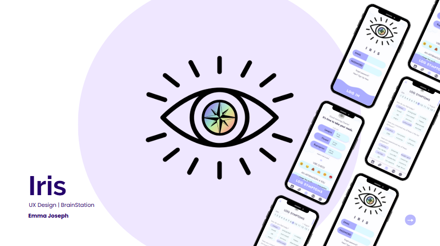
iris
A HEALTHCARE TRACKING APP

Iris is an intuitive healthcare app for people struggling with chronic mental and physical health issues, aiming to help clients who are feeling overwhelmed and frustrated with their medications and unable to understand the cause of their issues.
While there are many tracking apps currently on the market, they often work only as a reminder app and library of the medications and don’t take into account the way the medications make the patients feel.
A patient’s emotional and mental wellbeing are just as important as their physical health, especially when so many antidepressants have lasting effects on the brain and body. The goal of Iris is to allow users to observe the patterns formed between their emotional health and the medications they’re taking.
the inspiration

As someone who has struggled with mental and physical health and experienced the ups and downs of trying new medications first hand, I understand how overwhelming and frustrating it can get when trying to figure out what works best for me. Sometimes, it can feel like medications are just thrown at you, and you’re just hoping for something to stick. Other times, the medication works, but not without a small cost. Weight gain, overactive sweat glands, hyperpigmentation, weakened tendons—all popular side effects I’ve felt from my myriad of medications.
It’s easy enough to keep track of when there’s only one issue to focus on, but when you’ve got to worry about asthma, eczema, anemia, allergies, sports injuries, dental procedures, and everything else under the sun at the same time, the number of antidotes to your issues makes it feel like you’re running a pharmacy out of your home.
I once had four different medications to take all at once just for my nasal congestion and seasonal allergies, which didn’t even get into the other five I had on deck for my other physical health problems. All this to say, it can be a lot. With Iris, my hope is to take a lot down to a little with the help of an engaging, intuitive application.
IRIS
IRIS
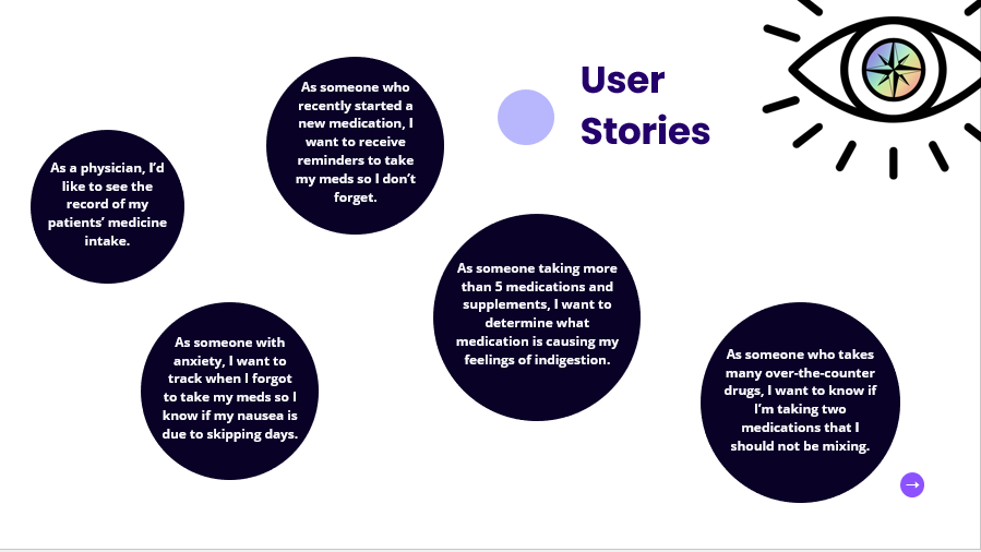
Symptom Identification: Psychiatrist patients have difficulty distinguishing what symptoms are caused by the medications they’re taking vs. other influences.
Difficulty with Management: Adults with chronic illnesses often feel helpless and overwhelmed when trying to manage their symptoms, especially when they have to try multiple medications.
Overwhelm & Hopelessness: Adults with mental health issues may feel frustrated by their medications and exhausted by the process of trying out options.
early hypotheses
RESEARCH
The goal of this research was to validate or invalidate my early hypotheses about how adults with chronic illnesses taking medications often have difficulty keeping track of their symptoms in order to inform product direction.
user interface

home screen evolution
initial wireframes
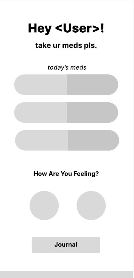
I wanted to create a playful and welcoming user interface to invite users to feel more comfortable when opening up the app. Many medical oriented applications are very minimal, cold, and uninteresting, so I tried out a couple of visually exciting layouts for the initial wireframe.
After building the app further in Figma, it was clear, however, that some of the elements were too busy once color and interactivity was added. Distracting elements, unclear functionalities, and unnecessary aesthetics seemed to get in the way of the end goal. I returned to the value propositions and user stories in order to realign myself with the goals of the app, taking inspiration from some of my own favorite apps that blend visual aesthetics with functional design.
-
low fidelity home page
This initial wireframed layout of the home page was one of three options I’d drawn out. This layout was the simplest, offering a cleaner feeling with the balance of negative space used while including aesthetic choices such as the pill inspired bars in the center to display the user’s medications.
-
initial high-fidelity design
Though the colors and font are playful, it felt too overstimulating and may be harder to read for those with visual impairments. I love the use of auras and gradients in applications, but I had to admit that this app’s home page was not the place for it. I decided to go even simpler, keeping the key elements but not overthinking the visuals so much.

-
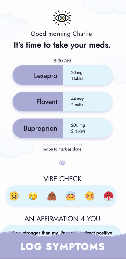
Latest high-fidelity version
Skipping the gradient for some subtle clouds in the background, this final draft version of the home page feels much lighter and cleaner in comparison to the first. The Log Symptoms button is clear and easy to see and tap, users are immediately greeted with their to-do list of medications to take, and they can quickly perform an “express check-in” with the Vibe Check mood tracker.
logo design
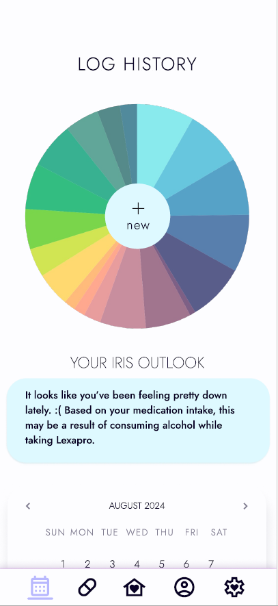
I had initially just planned on naming the app “Take Ur Meds,” going for a simple route to catch the attention of someone scrolling through the app store. However, after looking for inspiration in bullet journaling and habit trackers, I became inspired by the color wheel style trackers that are popular in the bullet journal community. The more I looked at it, the more it stood out to me, similarly to an iris, the colorful part of the eye. Deciding to base the main aesthetic pull from that, I rethought the elements of my app and created a simple logo using Canva.

final designs

presentation
You can view my slides for my BrainStation presentation here. I am currently working on a video prototype of the application to upload as well.